Wednesday, July 6, 2011

Before and Afters

Sometimes a good image can be made a great image with some solid post production aka photoshop. Either the colour is off, or the densities need some bumpin' or there is some shit in the background that was super impossible to avoid, thats when you can't avoid it, the dreaded photoshop! dah dah dahhhhhh. I definitely stand by the words that "photoshop should not be used to make a bad image better but a good image great!" Shoot the shit knowing that post production shouldn't be your life saver, try to do as much as you can to avoid spending time on the darkside, cause time is money right? nail it in camera first then take it to the next level in post. I try to do that as much as possible, but its impossible to avoid some post production, its just the reality of the game. Here are four images of mine that I shot with varying degrees of post done to them. the RAW image is on the left(or top) and the finished photo is on the right(or bottom). Before and After, Bam!

So this was a shoot for a private airline I did, the client and I wanted some major changes to the image. There were some major issues with the background and the girders in the ceiling that needed to be removed and simplified, aswell as a drain in the floor, red carpet t be extended and licsence removed from both plane and car for privacy issues. I also wanted the image to appear as if the young couple were arriving at night, so brought the background down quite a bit and added a little midnight blue to the situation.

Shot on film, the field in the foreground just wasn't doing it for me and needed to be bumped up to draw your eye in more. The colour for me wasn't where I wanted it to be, so dabbled in fixing that a touch and brought down the sky to get the clouds lookin' gloomier, cause that's how I roll, pure gloom fest.


This photo of famous playboy artist Doug Sneyd, needed a ton of tiny little things done to it to take it where I wanted it to be. First, we shot in his studio in his home, I really don't like messing with peoples stuff, as it maybe in a certain place for a certain reason, so the composition is pretty straight up. If you were to go into his studio now, this is legitimately what it would look like. There were some things I did want moved to make the background more simplified such as the door handle, plant and vent. There was also a painting on the wall and appeared to be coming out of dougs face, so got rid of that but isn't in the example above, my bad. I also did the usual colour correction on dougs skin and outfit.

From the same shoot as the first photo. This image for me looked pretty good but had some distracting shit in the shot and needed to be fixed. First the shadows were super ugly and hindered seeing all the way to the rear of the plane clearly, removed those. The model also had a leaf tattoo on her foot that needed to go, aswell as a few issues with the ceiling of the plane. Then the usual colour correction, as this is a digital image and digi red is not kosher. A bunch of little stuff was done to get this photo where its at, and deem it "client ready".

So here are a few examples of what I like to do to my photos, all photos are pretty good straight up but needed some touching up in post production to get them where I really like them and want them to be. word.


Thursday, March 17, 2011

Sex trophy.

I was recently approached by a friend of mine to take photos of her brand new baby the stork had just dropped off. Now normally I don't shoot this kinda stuff , just not passionate about it and I know some people that are, so I try not to tread on their turf. I Also know how some moms can get (experience from working at a lab for a while and having to do baby passport shots) they can get a little crazy. On top of crazy moms and being over the whole baby photos thing, people often want their babys doing some lame anne gettys shit which I am definitely not into, nor have time to entertain. However, Erin was down with whatever which made things much better and substantially less cheese.
I wasn't sure how to approach this type of gig, so I decided on kind of a "photo journalistic look", baby and mom interacting while using natural light on my end, with a touch of some sucky attempts at more posey shots to round out the photo session.

baby Abe kickin' it in his crib.
This shot of Abe in his crib is my attempt at something a little more posed. I tried to make it natural, baby sleeping, they do that right?
baby Abe and mother.
Luckily Erin has a sweet pad with lots of character and awesome big bay windows which added some sweet natural light which I was totally into.


Erin and baby Abe.
Like I said before, Erin's pad is full of character, hence this shot of a young mother Tereasa. I just loved the obviously juxtaposition here, one of my faves.
So I survived the dreaded baby shoot, this is my first and probably my last(unless the price is right). Its a lot of work and takes tons of patience and everything is based on a new born's mood which is ridiculously hard to predict, just not my cup of tea. I like grown up, even though they can act like babies too.

Wednesday, September 22, 2010

A visit to the doctor.

Michelle standing in for a lighting test.
The other day I shot some photos of a doctor for an article. Didn't realize how cramped those spaces are till I tried setting up a soft box and awkwardly banging into walls every where I went trying to position the damn thing. I ended up bouncing the light since that was the only real option I had without loosing my sanity. My efforts can be viewed in the up and coming Pie Magazine Issue 4.


Monday, September 13, 2010

Calspo Project

A while ago Tamara asked me to help her out with some photos that show what she does on a daily basis for a contest being held by CALSPO. The concept that we came up with, was to show the interaction of the SLP with the client while He/she interacts with a alternative communication device. We also wanted to show the actual speaking tool in a totally separate photograph aswell, so we paired them up in a dyptic to make them more effective and visually appealing. The dyptics ended up giving the project a contemporary feel, which is what we were going for. For Tamara and I it became so much more then a contest entry. I was glad I could help make something so moving for her, and I got to see the difference she's making for these kids(and families) first hand. So if we didn't win anything in the contest we still could feel good because we did something important for each other, awwwwwe(we ended up getting first in the photography category!)
To read the writing, click on the photograph.

Go Talk 20 AAC device aka "The Speak and Spell"

Speaking Green Button(not sure what the actual title is) an AAC device


Iphone as an AAC device.

So these tools are often used to communicate the basics, such as turning a page or what to eat, Anything that can help these kids communicate their needs, wants and opinions. I am quite obviously not educated in AAC but from what I understand and have heard and seen, the devices work by combining multiple buttons to form a sentence. This is especially the case with the Iphone and the Go Talk 20. The "Speaking Green Button" is slightly less elaborate and more basic but still equally effective in terms of transmitting a message.

Monday, August 23, 2010

Recent peoples.

Brandon no.4
I recently purchased new lighting equipment and have been dying to use it, luckily I have some friends that like it when I take their photos and Brandon is one of them. He seems to be always down which is great because wrangling people to shoot can be difficult at times, no one wants a photo of themselves? I don't know if taking "nice family PG photos" is what I do but I do think the pictures I take are attractive in one way or another.
I do feel however feel this photo isn't as good as it could have been(operator error, not you Bran its all me) and could even be described as a "miss". When I look at it I feel like it is something that would be considered average or something that might be produced in the first year of photography school. Maybe more post production, maybe a tighter crop could revive this sucker and label it "useable"? who knows.
Brandon no.5
The man that is always down, Brandon again, shot at Garage Studio. Shot similarly to my buddy Garrette, I just love showing the set and everything and using the environment to frame the homies. The great Annie L does this time to time, so why can't I? I find it interesting when other photographers do this because you get to see how they work, what they are working with and where they are working, its kinda like a lesson in lighting and composition all in one, plus it looks cool don't it? Cool lookin' photo is what its all about right?


Kim, broken nose.
One of my fave photos this year so far. Pretty straight up shot but the photo has an infinite amount of context and narrative that could be applied to it, its this that makes it so appealing to me. Thanks Kim.


Wednesday, July 21, 2010

Garrett in the Garage.

Garrett Williams.
Photo of my friend Garrett, Kenora newspaper writer extraordinaire. Shot on location at "The Garage Studio".

Garrett Williams no.2
Garrett was very relaxed infront of the camera and made shooting him super easy which is not always the case when shooting friends. Oddly I still have friends that are nervous when I take their photograph no matter how long I have known them.

Tuesday, June 22, 2010

Changes.

Andrea no.1 Originally shot for the series "Immortalized In Flesh"
This is the first version of the Andrea photo for my series "Immortalized In Flesh" that I recently removed and replaced with the image below, making a better fit with other images.

Andrea for the series "immortalized In Flesh"
This photo was taken a while ago for my second coming of the series "Immortalized In Flesh" that I initially passed on. I returned to it as I liked the shape and just the look that Andrea has, plus her first photo didn't mesh well with another photo I took later of 'Kim' that was posed in a similar way. The photo of Kim looked better interms of posing in conjunction with her amazing tattoo work, so Andrea got the boot and had to be switched up for variety purposes. Deems da breaks! Luckily I like this photo just as much as Andreas first intended shot(and so does she), so its all good!

Wednesday, June 16, 2010

No Toast.


Tamara cutting to the chase!

Wednesday, June 9, 2010

Bitchin' Brooklin Fair.

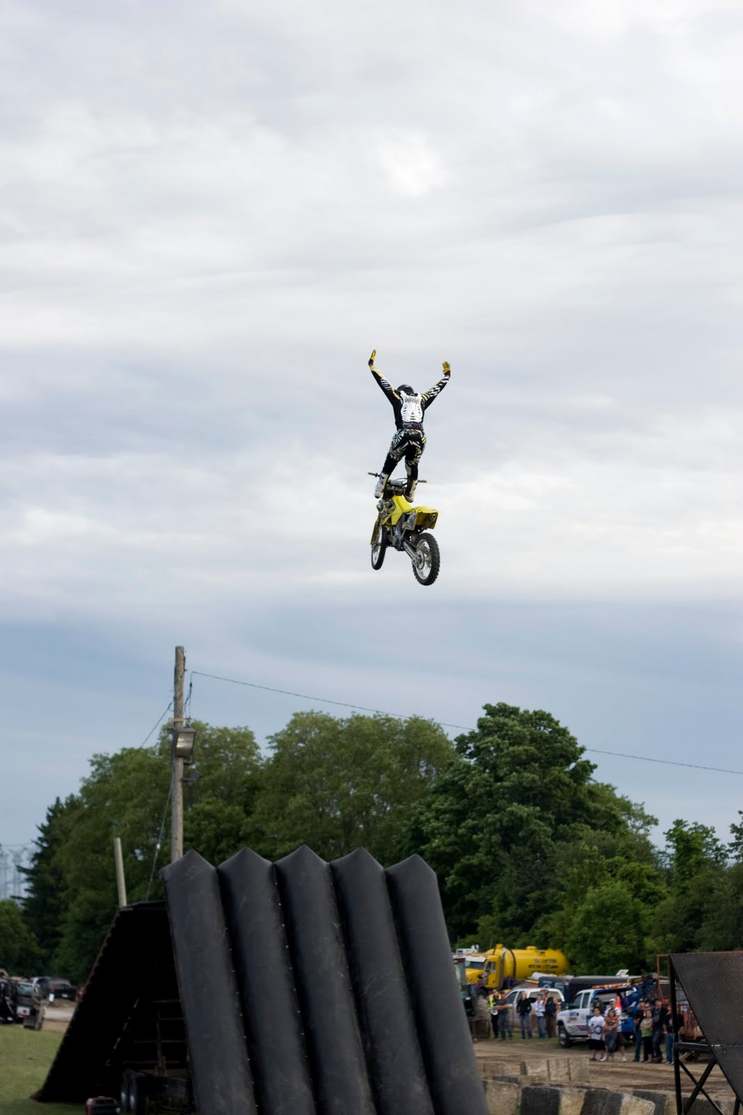
So recently My girlfriend Tamara and I went to check out the Brooklin County Fair, just outside of her home town of Whitby. I was picturing like a small ghetto little fair that usually comes to various towns throughout ontario in the summer. Boy was I wrong! This is like a huge oldschool kinda fair with all kinds of rides, ridiculous amounts of tasty americana-isk food to eat, freestyle motocross(dirt bikes hitting huge jumps) and a totally bitchin' crash up derby to top things off. A pretty epic time was had!
Whats a fair without rides that are put together in an hour and the unsuspecting parents that send their kids down them.

So this is mid crash up derby, I was told that these were the amateurs. Once the pros came out after this match (they take things to the next level!) you could see the difference right away; Flooring it and crashing at full speed into each other, fighting with the ref's and as told by an ex derby pro sitting near us, that all the competitors usually hate each other! It was like a manly white trash version of a soup opera!

There was some epic backgrounds there also(this was one of them) whens a 7b around when you need one? Oh well, next time.


Dirt bikers hitting huge jumps and doin' awesome tricks that one would see on the X Games was pretty sweet! luckily no one ate shit and all the bikers survived to jump again next year.

Wednesday, May 19, 2010

New portraits.


So a long while ago I was shooting photos of people and their tattoo work for the series entitled "Immortalized In Flesh" but had to be put on the back burner as duty called else where aka a whack load of magazine shoots for the totally awesome Pie Magazine. I recently revisited and revised the look of "Immortalized In Flesh" and have been shooting new photos of my friends and friends of friends and their tattoo work they have had done. They all have tattoos for different reasons but are connected through their loving embrace of the art form, design and skill involved in tattooing. Something this series documents.
Nicole.

Kim.


Jeff.

Wednesday, April 7, 2010

A bittersweet Applied Arts win.


Applied Arts winning image- "Margaret"
In early March I received an email with some much needed good news. I had been chosen as a winner of the prestigious Applied Arts annual professional photography award in the category of portraiture. My grandmother who was the subject of the winning photo had just died a few days before. During the last few monthes of her life, I was responsible for looking after her as she was bed ridden as a result of Lung Cancer. Looking back I remember when I asked her if I could use the photo for the competition many months before, her reply was "if it will win you an award for something then sure!" at the time I was thinking "well Marg don't get your hopes up....." as in the past Applied Arts has a funny way of picking winners, as they have passed on some REALLY talented photographers and peers of mine. Regardless of their motives this one really meant something to me and I am glad my image conveyed that to them in some sort of way. This was my first award as a professional and I am super glad it was with this photo!

The full artist statement for this photo can be viewed on my website under "personal Photographs"
http://ianjameshopkins.carbonmade.com/

Family Visit.


So my sister Christine came all the way up from Massatuchutes for a brief visit a few monthes ago. While she was here she asked me to take a photo of her. These are my two faves. The shoot consisted of 1 flash, 2 backgrounds and LOTS of fun!
Christine.


Christine 2.

Tuesday, April 6, 2010

Training Wheels: learning new programs!

Test shot from a recent shoot: Edited in Lightroom
So I recently got the program Adobe Lightroom 2. I have been looking around for some post production jobs to supplement my need for new gear and pay for personal projects. Everyone I talked to or met with said this program was the way to go! Well I have been messing around with this puppy for about a week now and boy do I feel like a fish out of water! I have been an avid user of the ol' CS3 and I have gotten pretty darn comfy with its interface and way of doing things. The Lightroom has really shaken things up for me and kinda showed me a new way of processing images. I think it is going to be an awesome program for images within a series and have been shot on similar backgrounds or densities, its like slacking off and not using the numbers to match image colour tones(which can be a pain in the butt anyways). I admit lightroom is way over my head at the moment but as the days go by I feel less overwhelmed and more at the helm! Here are some of my recent adventures in the room of light.

Self Portrait-edited in Lightroom
So I have found that the Lightroom is pretty great for editing colour tones. It can be a little difficult at times but once you get a slight hang of it, it definitely gets easier and more fun too! that's the name of the game right?

Tamara-Wasaga Beach: Lighroom Edit.


Self Portrait: Edited in Lightroom.
All in all I feel Lightroom is an awesome program for editing large sums of photos that need similar tones and contrasts or images that need basic post production done to them. However Lightroom is a little stiff and complicated to get started with, some of the jargon and such is difficult to get into and understand at first. Its also lacks good selection tools, something that I use very often in photoshop. Other then these few things its a pretty sweet tool to get a good base colour and density before "exporting" your images to photoshop. word.


Wednesday, March 3, 2010

Flowers.

With the death of my grandmother comes great sadness but what also comes with a passing of a loved one are often beautiful flowers from fellow family members, co-workers and neighbours or the deceased long lost friends that most likely have learned of the death through a newspaper. These are the flowers that were recieved at my moms home aswell as roses left at my grandmothers grave.

Roses to be left at the grave.

Flowers from a doctor my mother works with.

Flowers from my girlfriend Tamara.


Flowers from my mothers co-workers.

Monday, January 11, 2010

Fun with Portfolio Designs and Layouts!

So now that I have a little bit more free time on my hands(closing of the lab I was working at), I have spent that free time getting to work! I am in the process of designing a new portfolio and everything that comes along with that. I'm busy fine tuning images, writing artist statements or captions(should the photo need it) and graphic design. Portfolio time is where I get to hone my self taught graphic design skills, as I have a slight love affair with design and with the whole process. So here are some flats and title pages that I have come up with recently. Enjoy


Layout from the series "Private Commission: The Agar Family and Select Friends"


Title flat for the series "Immortalized In Flesh" Which features portraits of tattoos and the people that have them.


A test layout of Brandon and Tiffany (tattoo enthusiests) from the series "Immortalized In Flesh"


Title page for the section of the portfolio which features commercial, editorial and random portraiture.


A test flat of Two restauranteurs from the "people and portraiture" section.


Tuesday, January 5, 2010

Dabbling In Landscapes.

Framed landscape in my basement
This is a landscape dyptic that I shot while going for a stroll along Lake Ontario in Whitby. The area was very beautiful and it was a gorgeous day, what caught my eye was this enormous factory being hidden by this huge hill. I thought it was kinda funny in the sense that it was purposely hidden in a really crappy kinda way. I imagine what the city planners conversation might have been.

city planner1- " We really want to develop the lake shore to attract the public but theres that huge eye sore of a smelting plant ruining it all........."
city planner2- " why don't we pile up some garbage and put sod over it, creating a hill that will hide the plant?"
followed by a round of high fives
city planner1- "genius!"

Its the elephant swept under the carpet kinda way that compelled me me to shoot photographs of its hilarity and create this dyptic. Its not really for any art show or anyone for that matter(I am not sure most people might get the humor in the situation) but i felt it couldn't just stay on the desk top, so I went and made some photographs.
The prints are being sandwiched between plexi-glass and board which has a hole routered on the back for hanging purposes. Each frame and print is 36x24 inches, if you were wondering.
Factoryscape dyptic

Close But No Cigar: Pie Magazine Issue 2

Here are some of my images I shot for Pie Magazine Issue 2. Images that I like to consider "close but no cigar". They made the short list but didn't get much further then that, Sometimes it was my choosing sometimes someone else's

This is a shot of Kent( the owner?) from the upscale restaurant " Micheal and Marions". he suggested that I shoot him filling a patrons glass with champagne. After a couple trys and close misses we decide that pouring + trying to look totally normal while looking straight at the camera was way way too hard and time consuming. So we switched him to a "pre pour" kinda situation. That went well and was somewhat of a success( lighting was good minimal shadows and less of a strained looking pose). However when I opened up the image in Bridge i noticed that one of the "extras" faces was half showing and partially blocked by blond hair. If you know the schooling that I have had(and I know many of you do) its to never leave something half in or half out, this was the case with this shot. Close but no cigar.


So this is one of many shots I did for a mens fashion editorial that made the shortlist. The theme was obviously croquet and for me the shot is awesome, has that kinda stiff anti pose pose that I have in many of my photos. However when it came time to picking what was actually going to be run, this one didn't make it out of the gates! still a favorite of mine from that shoot. Close but no cigar.

This was one of three poses we did with this particular outfit for the same mens fashion editorial, nothing really wrong with it( the flare was intentional), just one of the others looked better. Close but no Cigar.


Pie Magazine did a story on various modern jobs. This is a photo of Sarah Jackson, a canadian top model( the face of Shoppers Drug Mart I was told) for the story they did on her. This shoot was particularily difficult, not in execution but in the fact of how to show a modlels job without showing the obvious- a model shot. So the magazine and I deiced on the theme of "making calls and scheduling". I wanted to do something super basic, almost a monochromatic image, super simple. This particular shot was in the list but I think the final verdict was too plain and not flattering enough. Close but no cigar.


This shot of sarah Jackson was close to be run but what held it back was the fact it didn't show of her long gorgeous legs and more of her body, something models are obviously famous for. Close but no cigar.