Sometimes a good image can be made a great image with some solid post production aka photoshop. Either the colour is off, or the densities need some bumpin' or there is some shit in the background that was super impossible to avoid, thats when you can't avoid it, the dreaded photoshop! dah dah dahhhhhh. I definitely stand by the words that "photoshop should not be used to make a bad image better but a good image great!" Shoot the shit knowing that post production shouldn't be your life saver, try to do as much as you can to avoid spending time on the darkside, cause time is money right? nail it in camera first then take it to the next level in post. I try to do that as much as possible, but its impossible to avoid some post production, its just the reality of the game. Here are four images of mine that I shot with varying degrees of post done to them. the RAW image is on the left(or top) and the finished photo is on the right(or bottom). Before and After, Bam!
So this was a shoot for a private airline I did, the client and I wanted some major changes to the image. There were some major issues with the background and the girders in the ceiling that needed to be removed and simplified, aswell as a drain in the floor, red carpet t be extended and licsence removed from both plane and car for privacy issues. I also wanted the image to appear as if the young couple were arriving at night, so brought the background down quite a bit and added a little midnight blue to the situation.
Shot on film, the field in the foreground just wasn't doing it for me and needed to be bumped up to draw your eye in more. The colour for me wasn't where I wanted it to be, so dabbled in fixing that a touch and brought down the sky to get the clouds lookin' gloomier, cause that's how I roll, pure gloom fest.

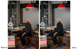
This photo of famous playboy artist Doug Sneyd, needed a ton of tiny little things done to it to take it where I wanted it to be. First, we shot in his studio in his home, I really don't like messing with peoples stuff, as it maybe in a certain place for a certain reason, so the composition is pretty straight up. If you were to go into his studio now, this is legitimately what it would look like. There were some things I did want moved to make the background more simplified such as the door handle, plant and vent. There was also a painting on the wall and appeared to be coming out of dougs face, so got rid of that but isn't in the example above, my bad. I also did the usual colour correction on dougs skin and outfit.
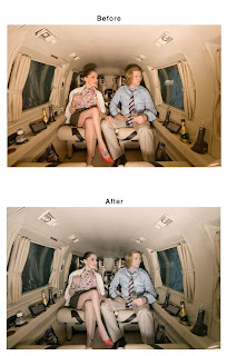
From the same shoot as the first photo. This image for me looked pretty good but had some distracting shit in the shot and needed to be fixed. First the shadows were super ugly and hindered seeing all the way to the rear of the plane clearly, removed those. The model also had a leaf tattoo on her foot that needed to go, aswell as a few issues with the ceiling of the plane. Then the usual colour correction, as this is a digital image and digi red is not kosher. A bunch of little stuff was done to get this photo where its at, and deem it "client ready".
So here are a few examples of what I like to do to my photos, all photos are pretty good straight up but needed some touching up in post production to get them where I really like them and want them to be. word.


.jpg)
.jpg)


