Wednesday, April 7, 2010

A bittersweet Applied Arts win.


Applied Arts winning image- "Margaret"
In early March I received an email with some much needed good news. I had been chosen as a winner of the prestigious Applied Arts annual professional photography award in the category of portraiture. My grandmother who was the subject of the winning photo had just died a few days before. During the last few monthes of her life, I was responsible for looking after her as she was bed ridden as a result of Lung Cancer. Looking back I remember when I asked her if I could use the photo for the competition many months before, her reply was "if it will win you an award for something then sure!" at the time I was thinking "well Marg don't get your hopes up....." as in the past Applied Arts has a funny way of picking winners, as they have passed on some REALLY talented photographers and peers of mine. Regardless of their motives this one really meant something to me and I am glad my image conveyed that to them in some sort of way. This was my first award as a professional and I am super glad it was with this photo!

The full artist statement for this photo can be viewed on my website under "personal Photographs"
http://ianjameshopkins.carbonmade.com/

Family Visit.


So my sister Christine came all the way up from Massatuchutes for a brief visit a few monthes ago. While she was here she asked me to take a photo of her. These are my two faves. The shoot consisted of 1 flash, 2 backgrounds and LOTS of fun!
Christine.


Christine 2.

Tuesday, April 6, 2010

Training Wheels: learning new programs!

Test shot from a recent shoot: Edited in Lightroom
So I recently got the program Adobe Lightroom 2. I have been looking around for some post production jobs to supplement my need for new gear and pay for personal projects. Everyone I talked to or met with said this program was the way to go! Well I have been messing around with this puppy for about a week now and boy do I feel like a fish out of water! I have been an avid user of the ol' CS3 and I have gotten pretty darn comfy with its interface and way of doing things. The Lightroom has really shaken things up for me and kinda showed me a new way of processing images. I think it is going to be an awesome program for images within a series and have been shot on similar backgrounds or densities, its like slacking off and not using the numbers to match image colour tones(which can be a pain in the butt anyways). I admit lightroom is way over my head at the moment but as the days go by I feel less overwhelmed and more at the helm! Here are some of my recent adventures in the room of light.

Self Portrait-edited in Lightroom
So I have found that the Lightroom is pretty great for editing colour tones. It can be a little difficult at times but once you get a slight hang of it, it definitely gets easier and more fun too! that's the name of the game right?

Tamara-Wasaga Beach: Lighroom Edit.


Self Portrait: Edited in Lightroom.
All in all I feel Lightroom is an awesome program for editing large sums of photos that need similar tones and contrasts or images that need basic post production done to them. However Lightroom is a little stiff and complicated to get started with, some of the jargon and such is difficult to get into and understand at first. Its also lacks good selection tools, something that I use very often in photoshop. Other then these few things its a pretty sweet tool to get a good base colour and density before "exporting" your images to photoshop. word.


Wednesday, March 3, 2010

Flowers.

With the death of my grandmother comes great sadness but what also comes with a passing of a loved one are often beautiful flowers from fellow family members, co-workers and neighbours or the deceased long lost friends that most likely have learned of the death through a newspaper. These are the flowers that were recieved at my moms home aswell as roses left at my grandmothers grave.

Roses to be left at the grave.

Flowers from a doctor my mother works with.

Flowers from my girlfriend Tamara.


Flowers from my mothers co-workers.

Monday, January 11, 2010

Fun with Portfolio Designs and Layouts!

So now that I have a little bit more free time on my hands(closing of the lab I was working at), I have spent that free time getting to work! I am in the process of designing a new portfolio and everything that comes along with that. I'm busy fine tuning images, writing artist statements or captions(should the photo need it) and graphic design. Portfolio time is where I get to hone my self taught graphic design skills, as I have a slight love affair with design and with the whole process. So here are some flats and title pages that I have come up with recently. Enjoy


Layout from the series "Private Commission: The Agar Family and Select Friends"


Title flat for the series "Immortalized In Flesh" Which features portraits of tattoos and the people that have them.


A test layout of Brandon and Tiffany (tattoo enthusiests) from the series "Immortalized In Flesh"


Title page for the section of the portfolio which features commercial, editorial and random portraiture.


A test flat of Two restauranteurs from the "people and portraiture" section.


Tuesday, January 5, 2010

Dabbling In Landscapes.

Framed landscape in my basement
This is a landscape dyptic that I shot while going for a stroll along Lake Ontario in Whitby. The area was very beautiful and it was a gorgeous day, what caught my eye was this enormous factory being hidden by this huge hill. I thought it was kinda funny in the sense that it was purposely hidden in a really crappy kinda way. I imagine what the city planners conversation might have been.

city planner1- " We really want to develop the lake shore to attract the public but theres that huge eye sore of a smelting plant ruining it all........."
city planner2- " why don't we pile up some garbage and put sod over it, creating a hill that will hide the plant?"
followed by a round of high fives
city planner1- "genius!"

Its the elephant swept under the carpet kinda way that compelled me me to shoot photographs of its hilarity and create this dyptic. Its not really for any art show or anyone for that matter(I am not sure most people might get the humor in the situation) but i felt it couldn't just stay on the desk top, so I went and made some photographs.
The prints are being sandwiched between plexi-glass and board which has a hole routered on the back for hanging purposes. Each frame and print is 36x24 inches, if you were wondering.
Factoryscape dyptic

Close But No Cigar: Pie Magazine Issue 2

Here are some of my images I shot for Pie Magazine Issue 2. Images that I like to consider "close but no cigar". They made the short list but didn't get much further then that, Sometimes it was my choosing sometimes someone else's
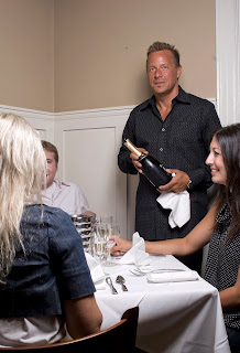
This is a shot of Kent( the owner?) from the upscale restaurant " Micheal and Marions". he suggested that I shoot him filling a patrons glass with champagne. After a couple trys and close misses we decide that pouring + trying to look totally normal while looking straight at the camera was way way too hard and time consuming. So we switched him to a "pre pour" kinda situation. That went well and was somewhat of a success( lighting was good minimal shadows and less of a strained looking pose). However when I opened up the image in Bridge i noticed that one of the "extras" faces was half showing and partially blocked by blond hair. If you know the schooling that I have had(and I know many of you do) its to never leave something half in or half out, this was the case with this shot. Close but no cigar.
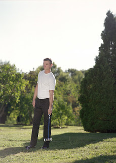

So this is one of many shots I did for a mens fashion editorial that made the shortlist. The theme was obviously croquet and for me the shot is awesome, has that kinda stiff anti pose pose that I have in many of my photos. However when it came time to picking what was actually going to be run, this one didn't make it out of the gates! still a favorite of mine from that shoot. Close but no cigar.

This was one of three poses we did with this particular outfit for the same mens fashion editorial, nothing really wrong with it( the flare was intentional), just one of the others looked better. Close but no Cigar.


Pie Magazine did a story on various modern jobs. This is a photo of Sarah Jackson, a canadian top model( the face of Shoppers Drug Mart I was told) for the story they did on her. This shoot was particularily difficult, not in execution but in the fact of how to show a modlels job without showing the obvious- a model shot. So the magazine and I deiced on the theme of "making calls and scheduling". I wanted to do something super basic, almost a monochromatic image, super simple. This particular shot was in the list but I think the final verdict was too plain and not flattering enough. Close but no cigar.


This shot of sarah Jackson was close to be run but what held it back was the fact it didn't show of her long gorgeous legs and more of her body, something models are obviously famous for. Close but no cigar.